

Projects
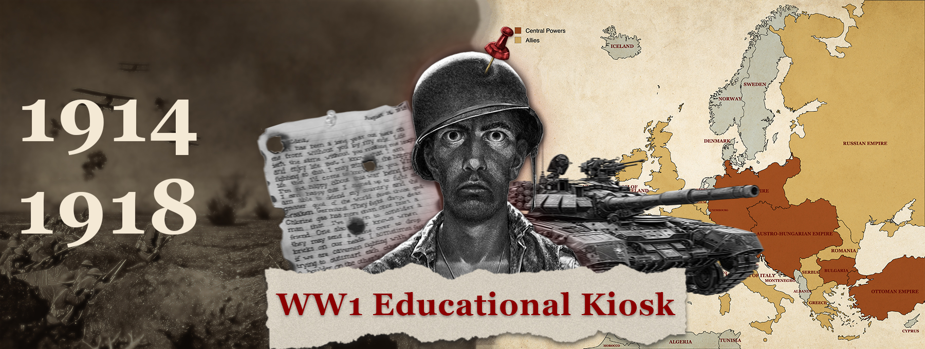
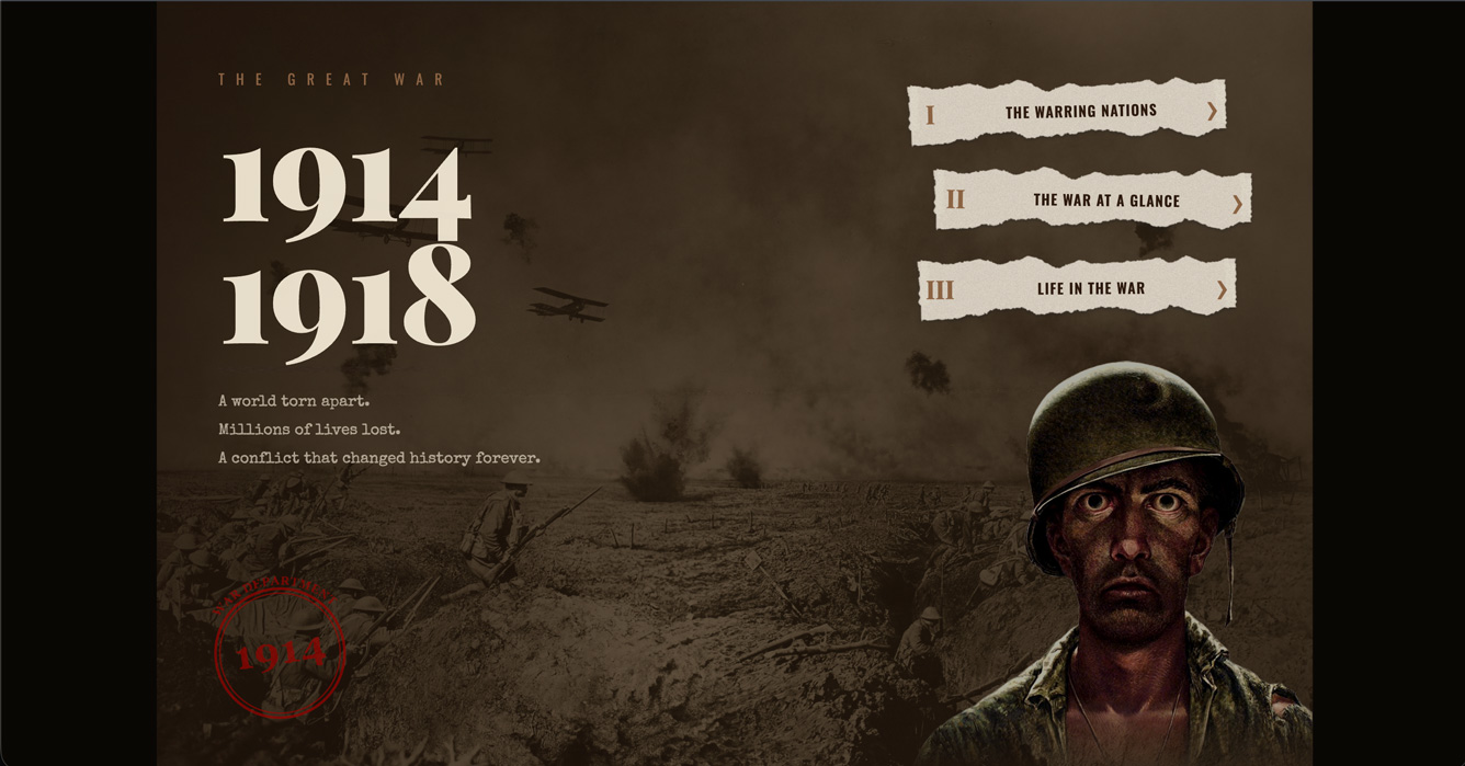
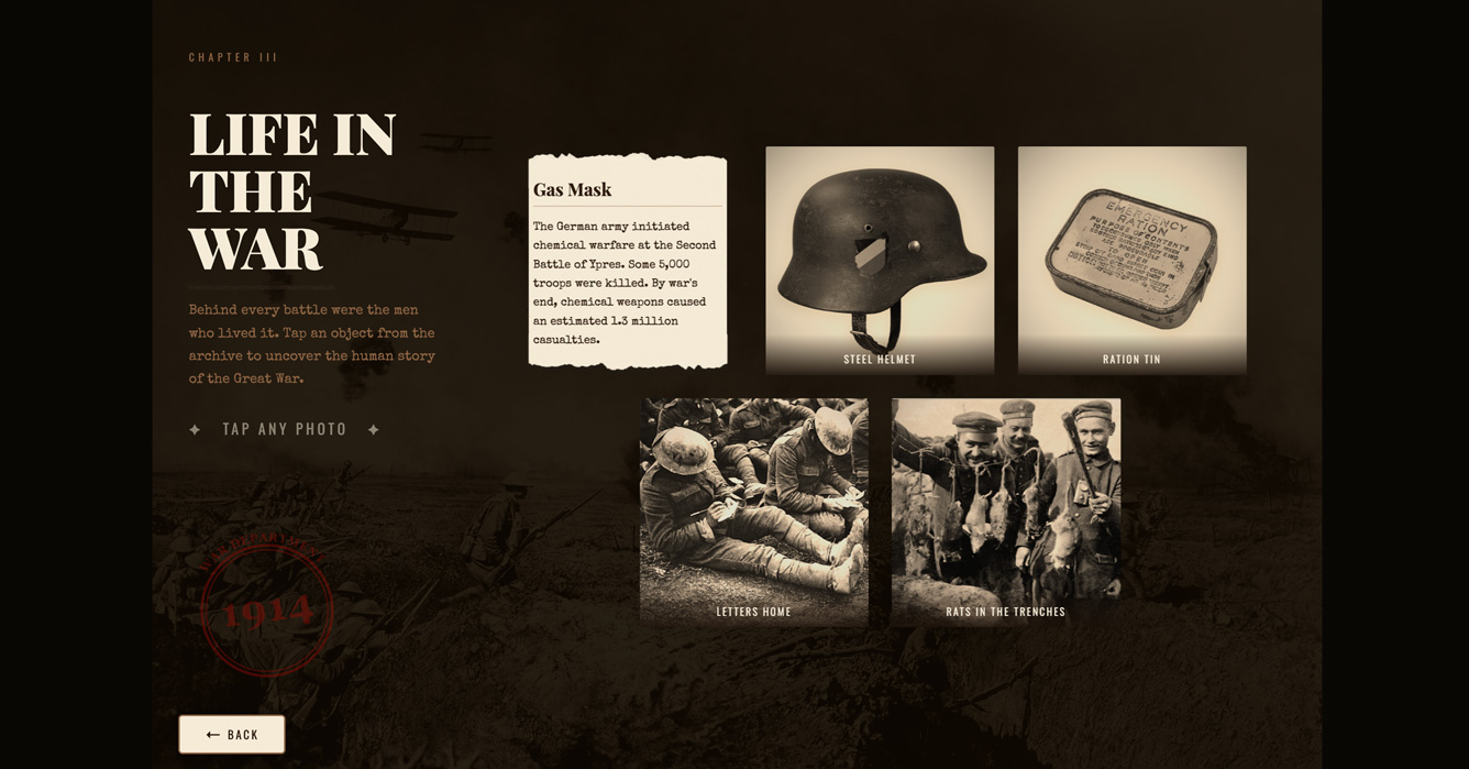
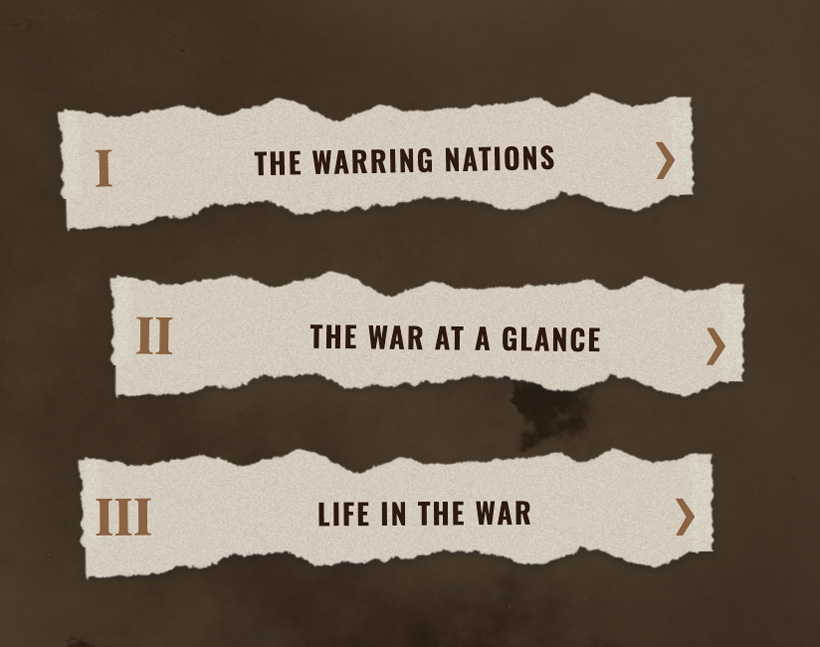
WW1 Educational Kiosk
A museum-style touchscreen kiosk that brings World War I to life through an interactive map, animated tank timeline, and archival flip-card archive — built for broad public audiences including children.
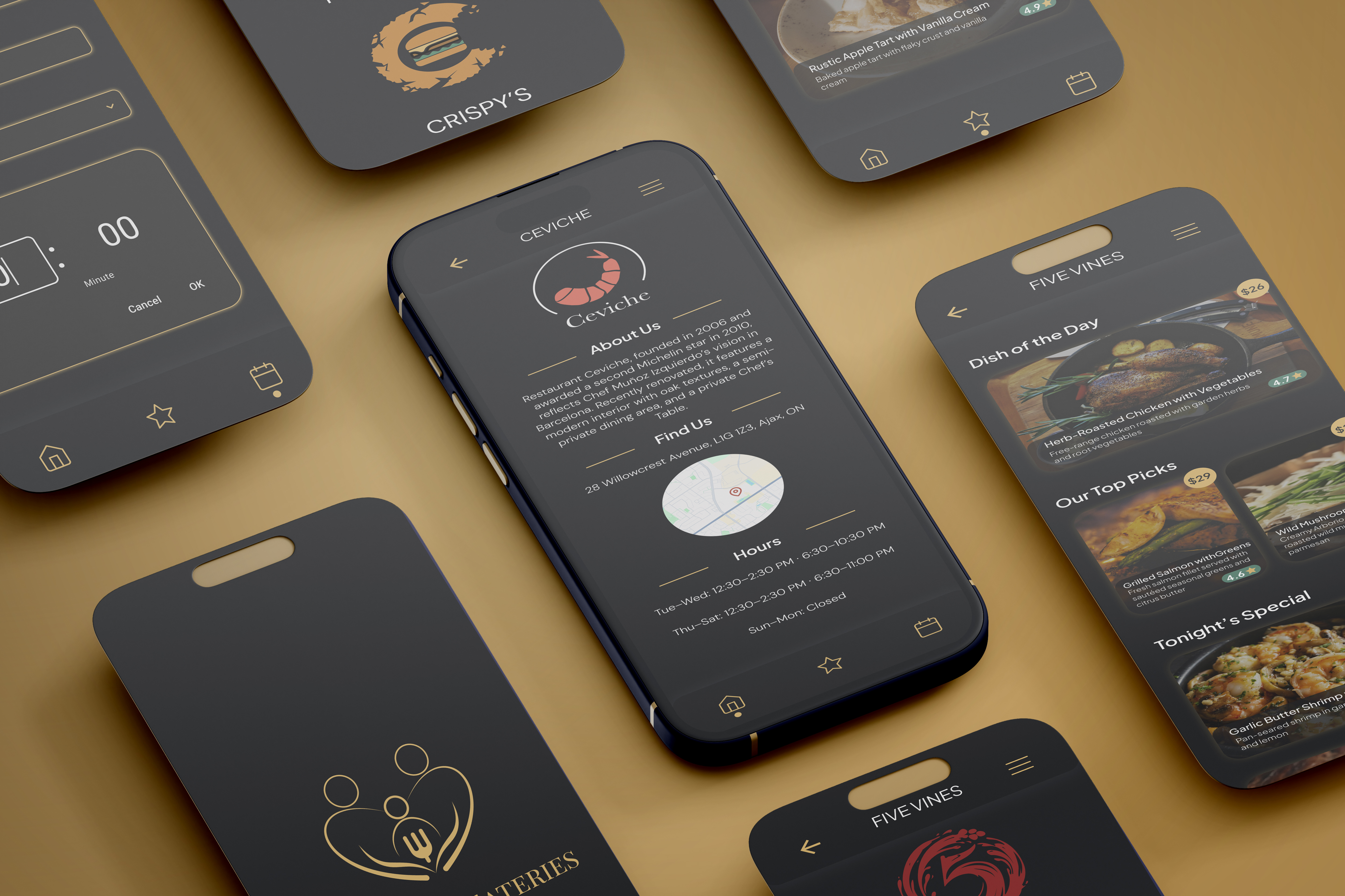
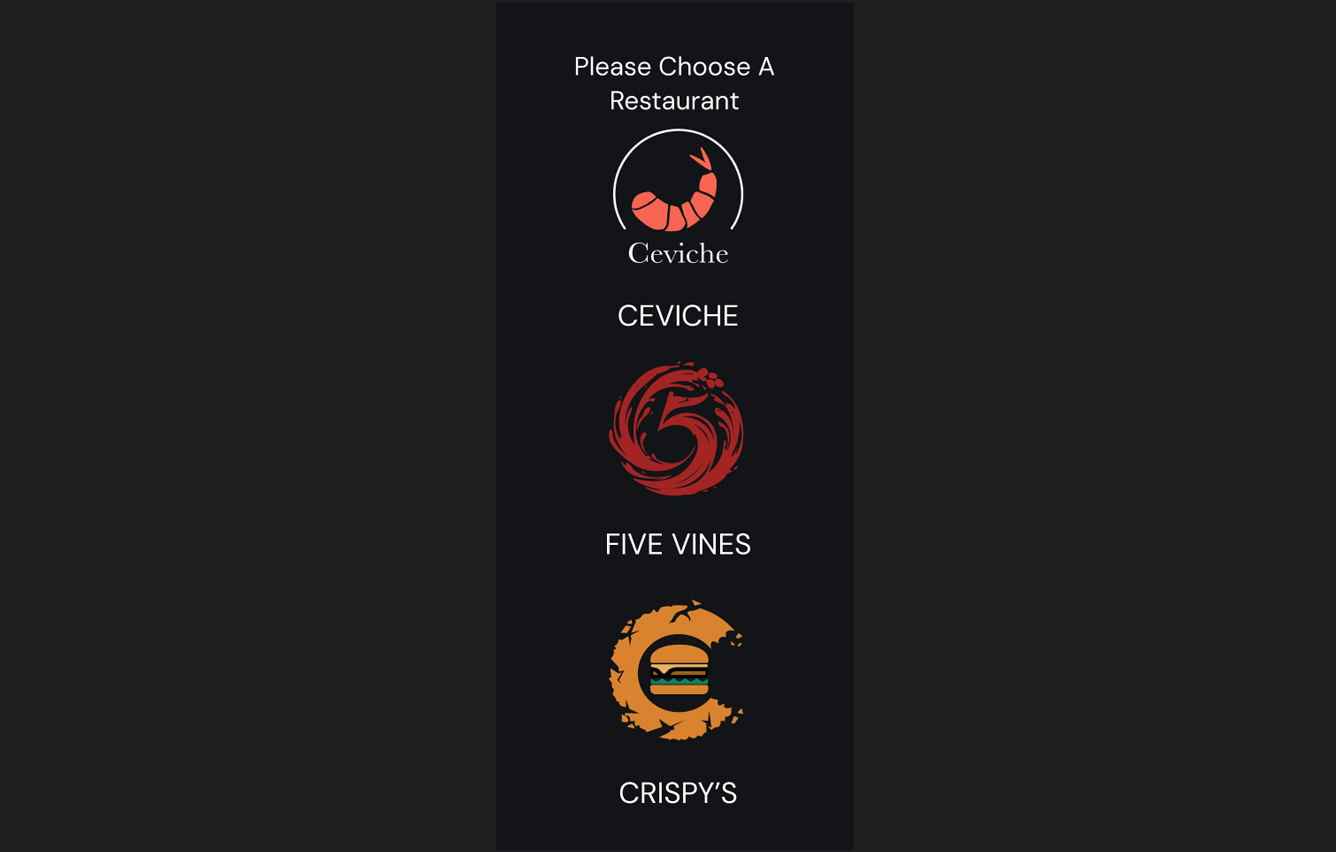
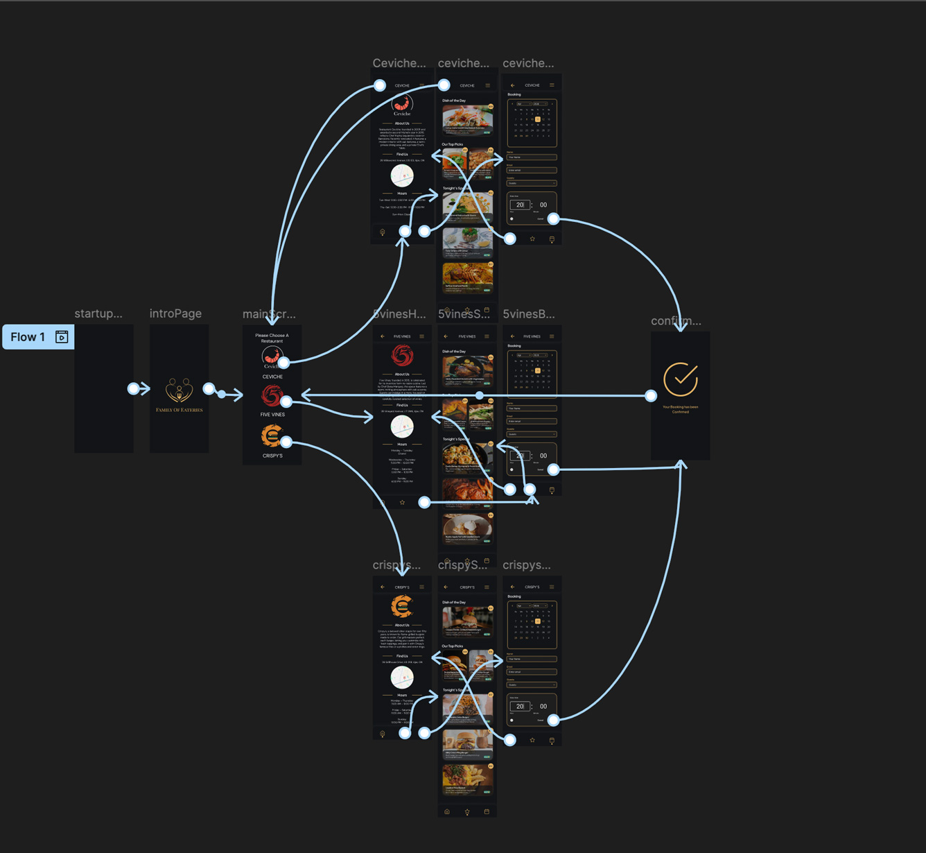
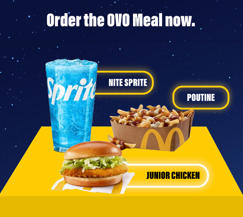
Family of Eateries
Animated interactive infographic experience that transforms how customers engage with restaurant menus and ordering systems.
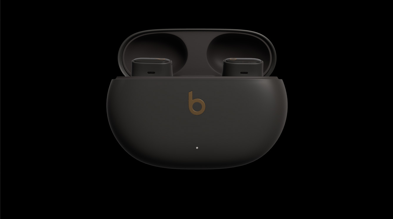
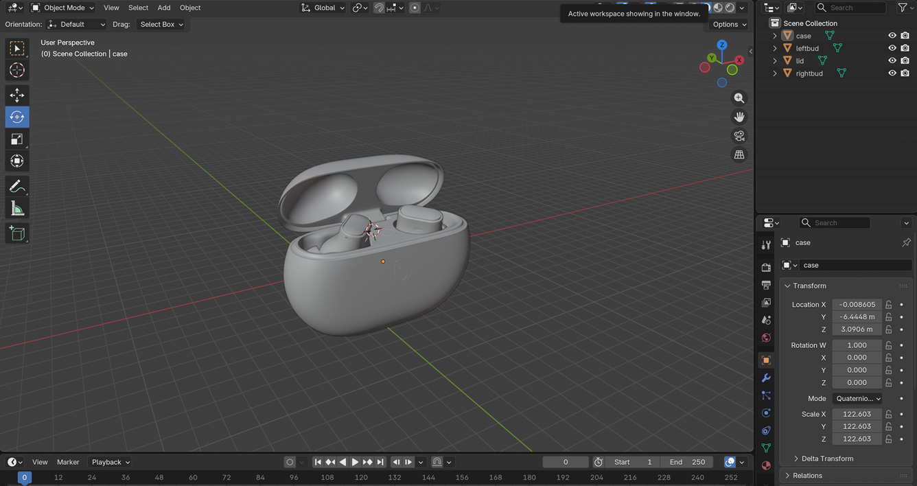
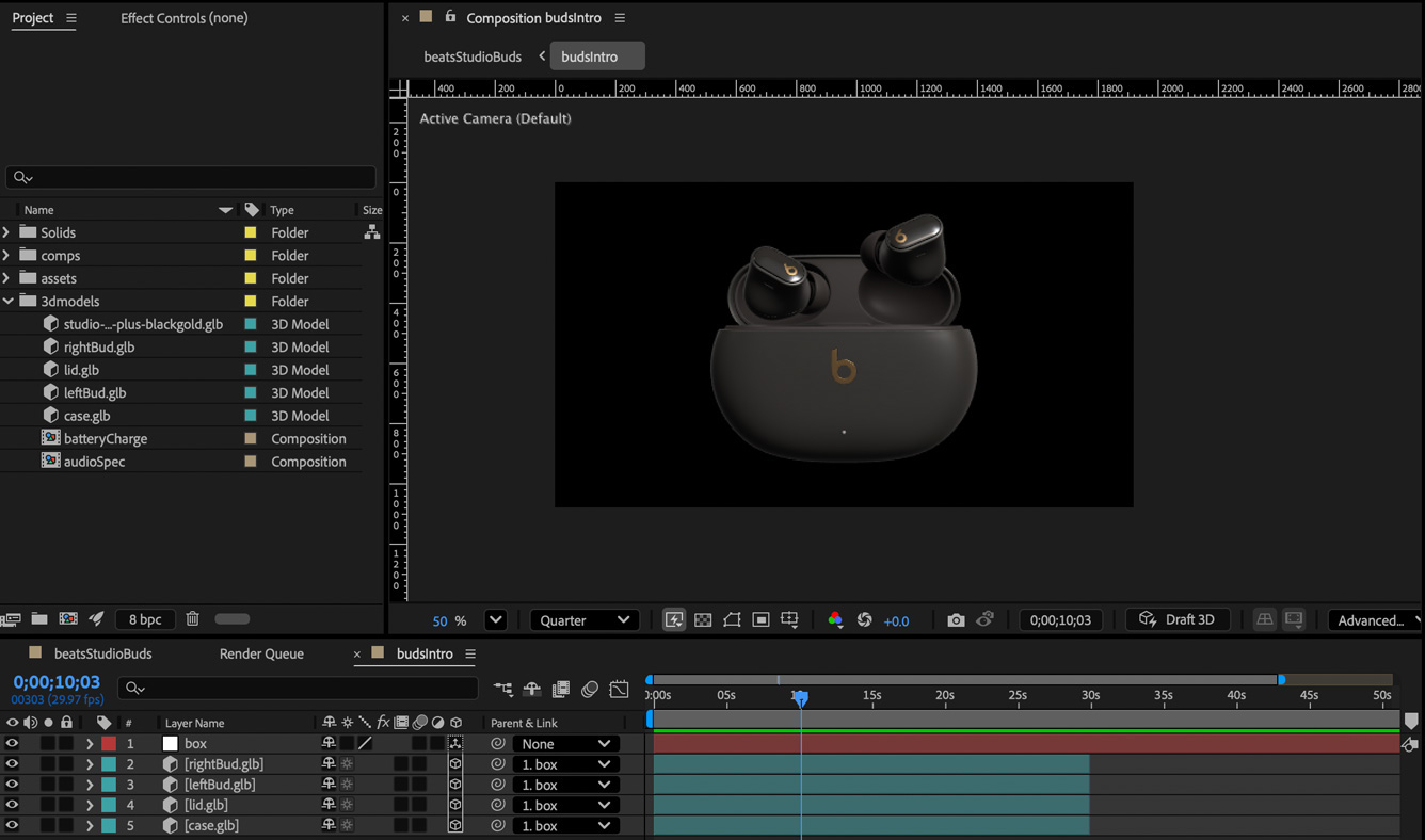
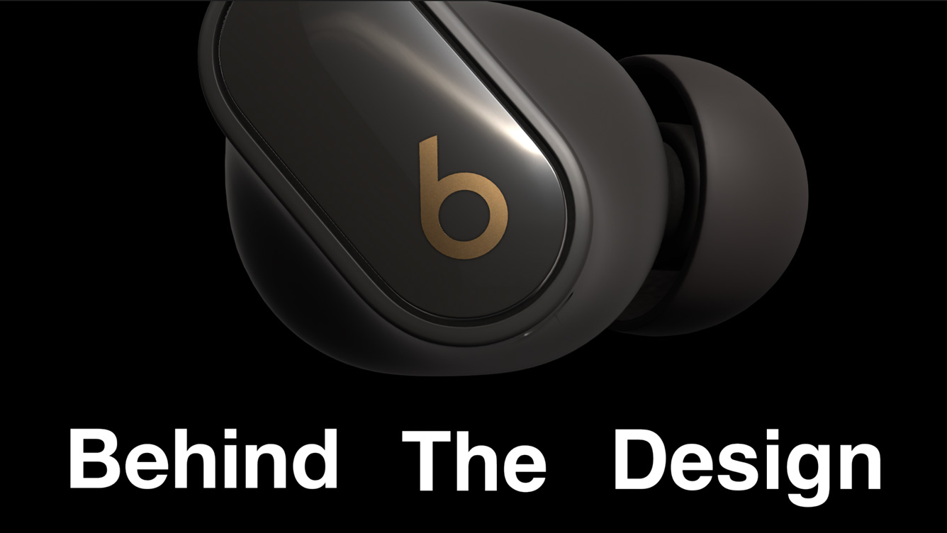
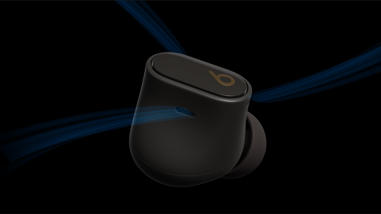
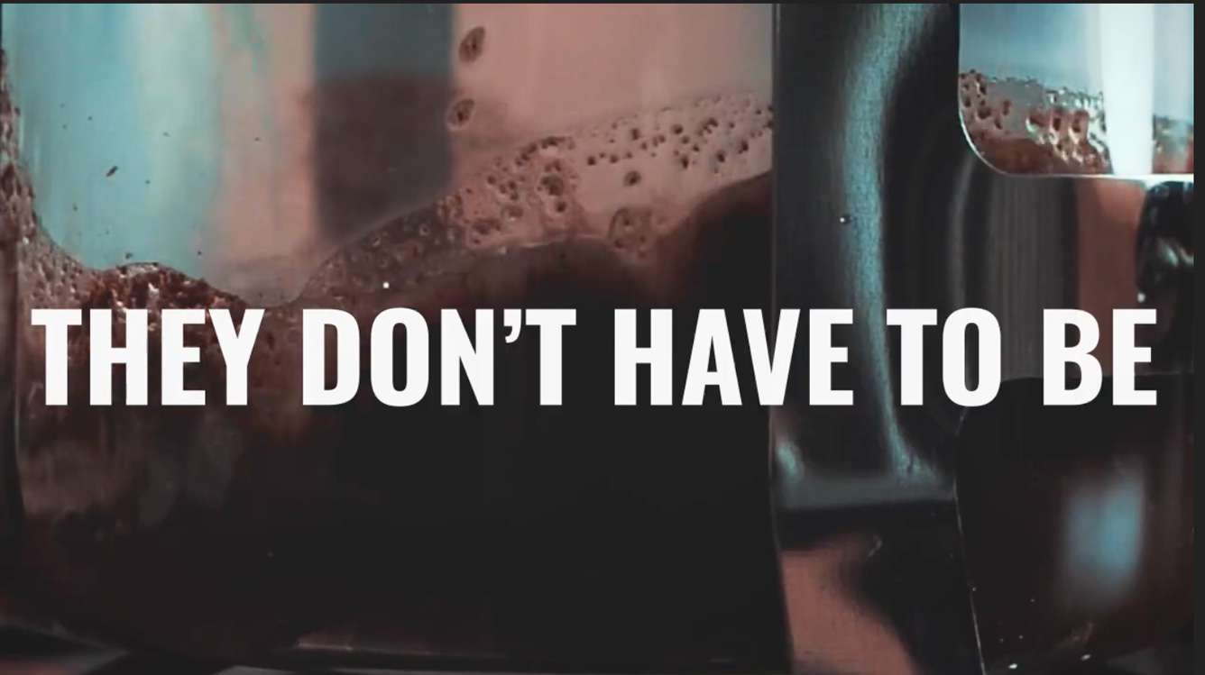
Beats Studio Buds +
A 60-second product motion graphic combining 3D animation and kinetic typography
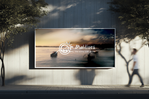
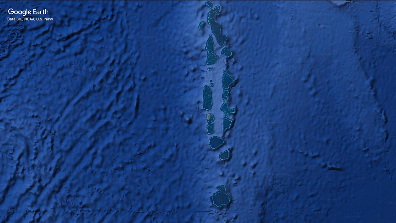
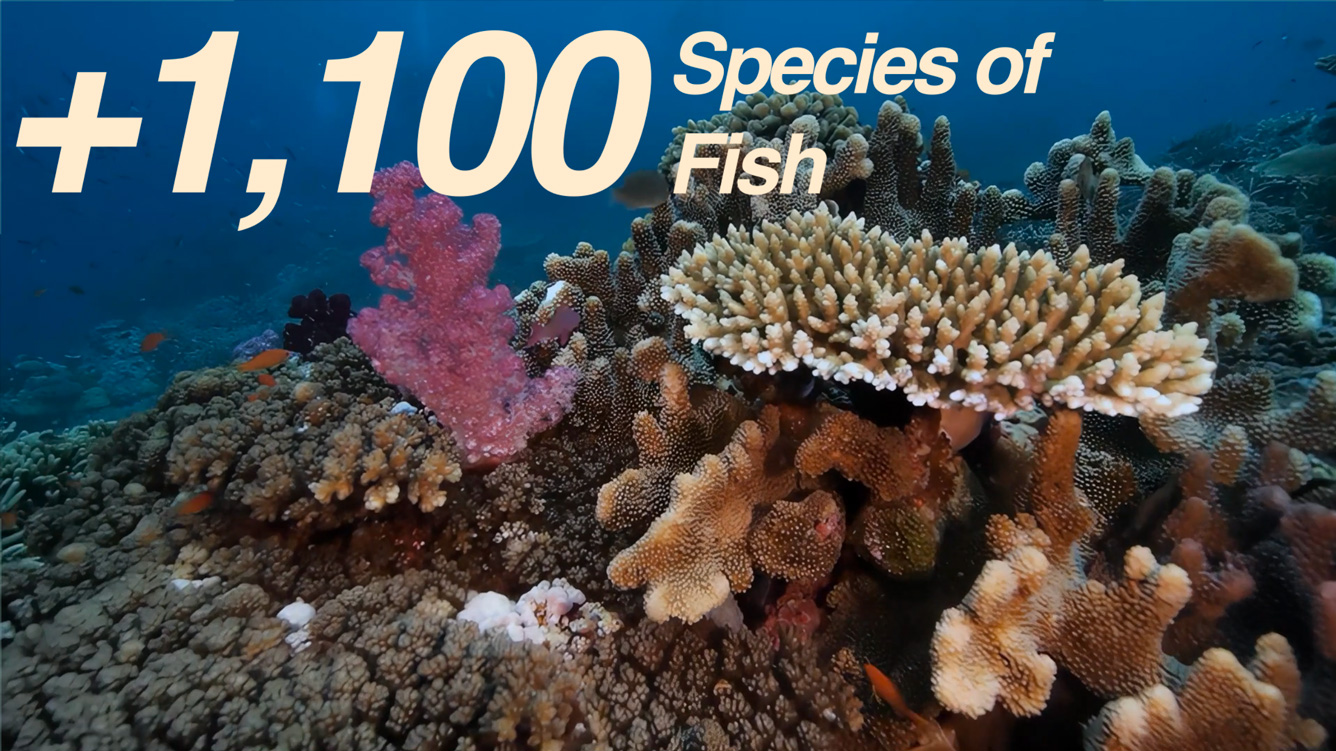
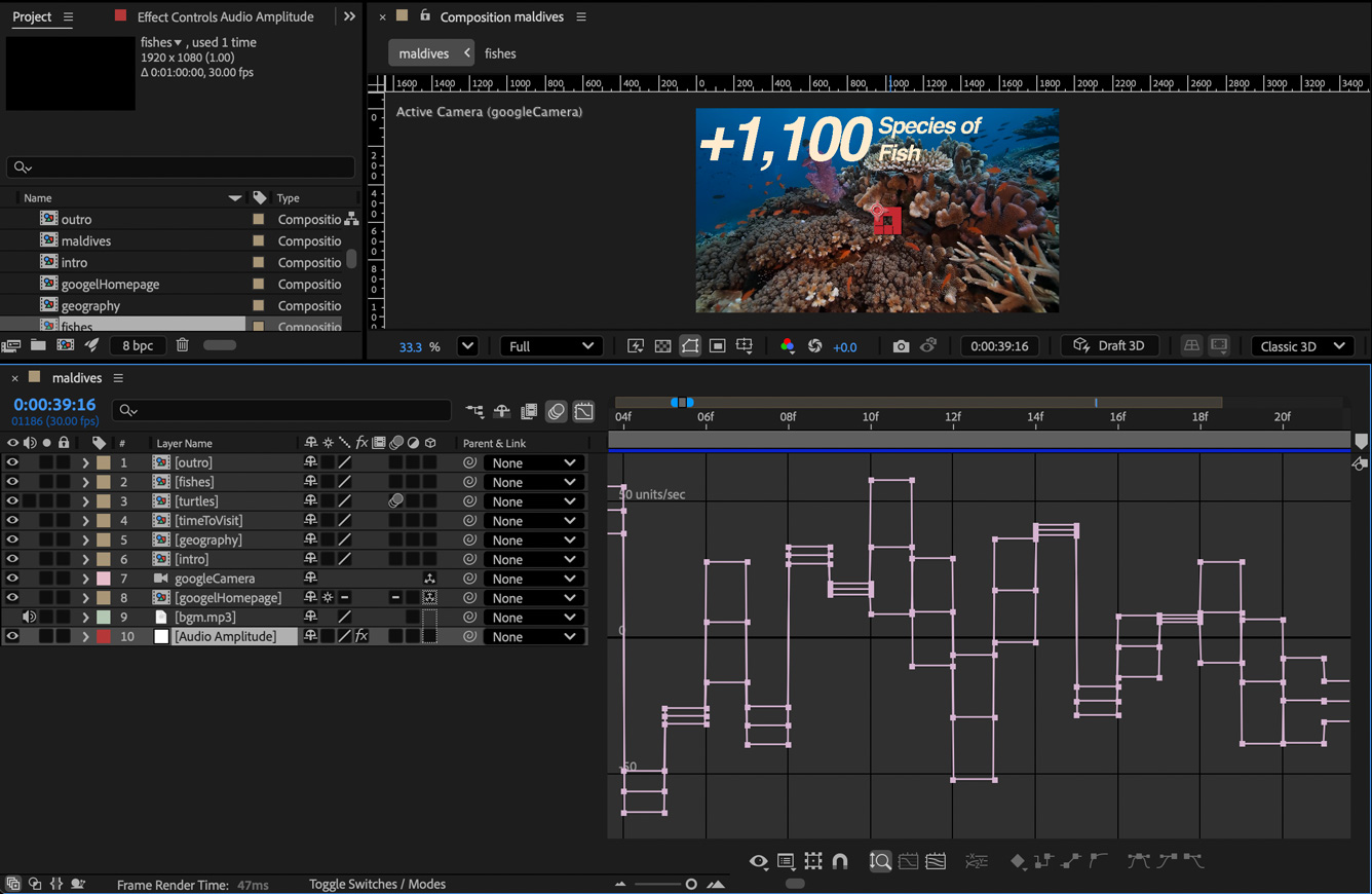
The Maldives — Motion Infographic
A 45-second broadcast-ready motion infographic for a luxury travel destination
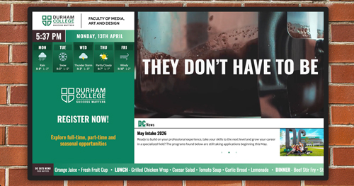
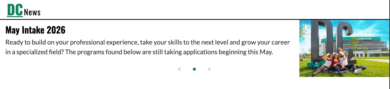
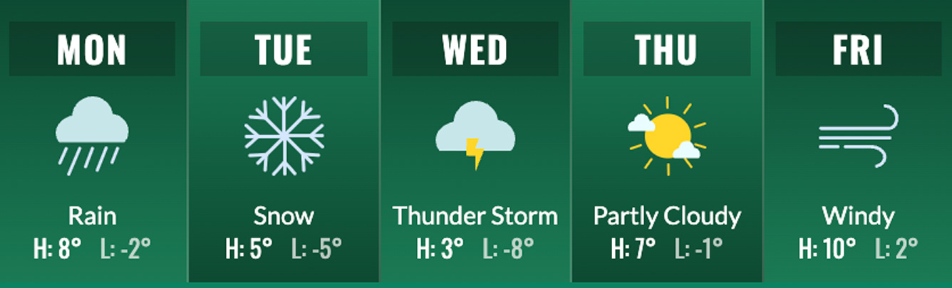
Digital Signage System
A real-time data-driven display board deployed live for Durham College
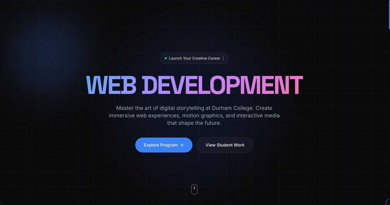
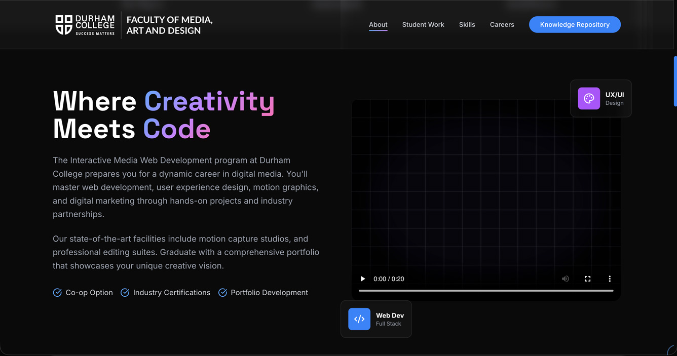
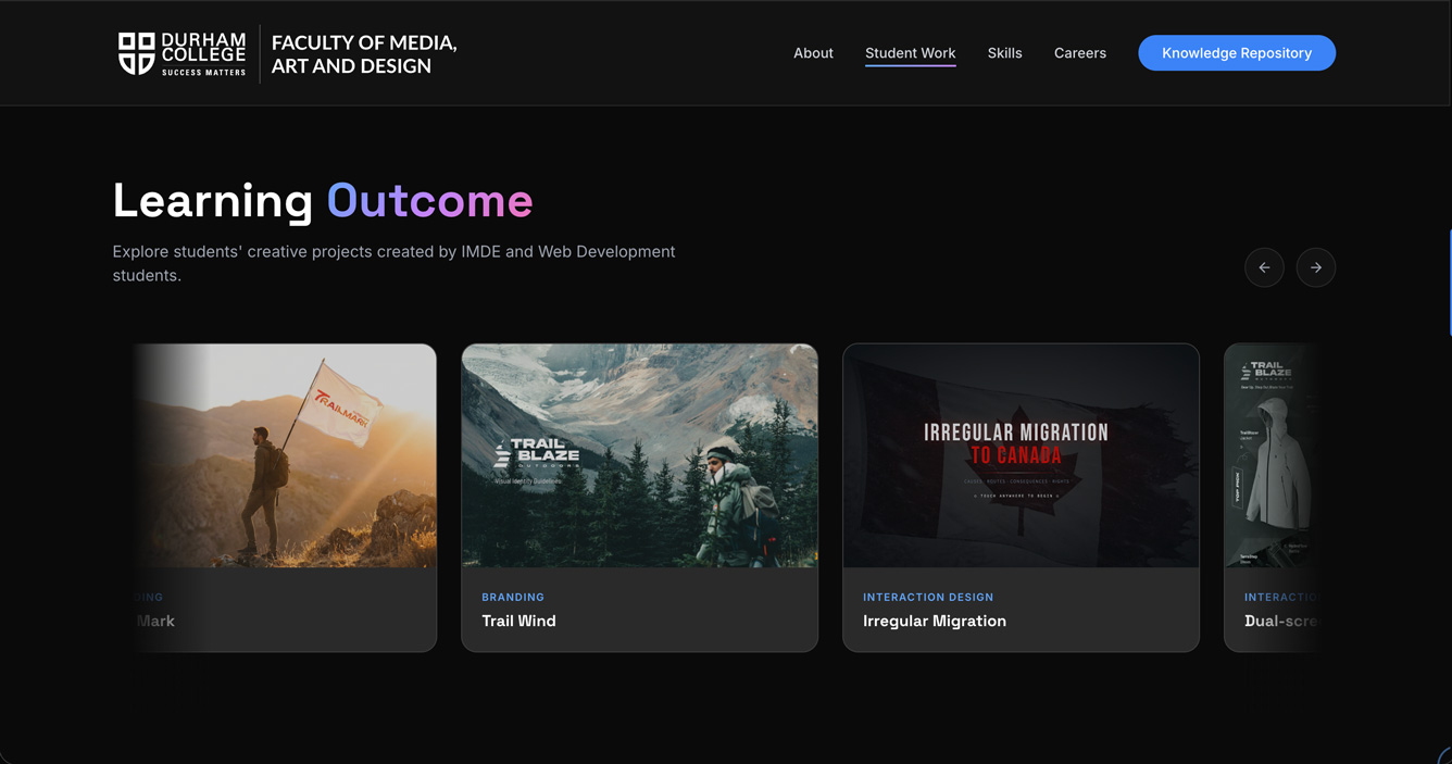
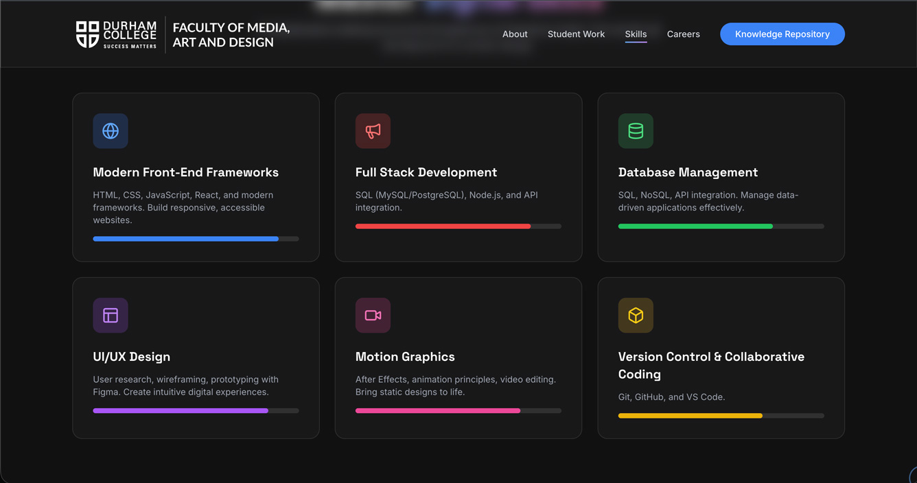
Collaborative Work
A team-built program website for Durham College's Web Development program
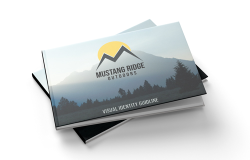
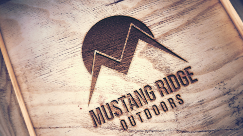
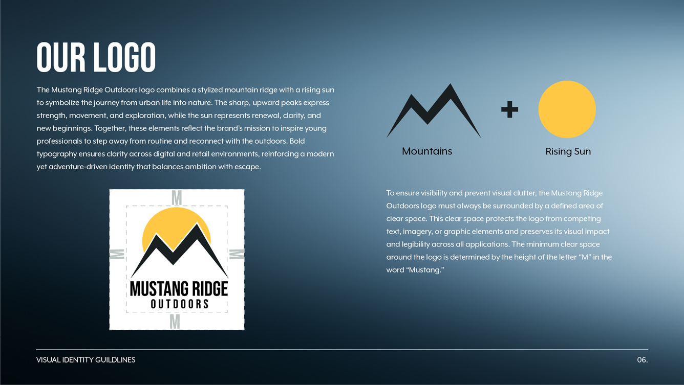
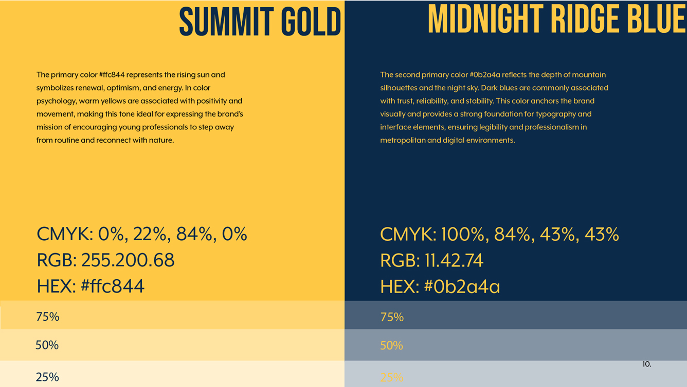
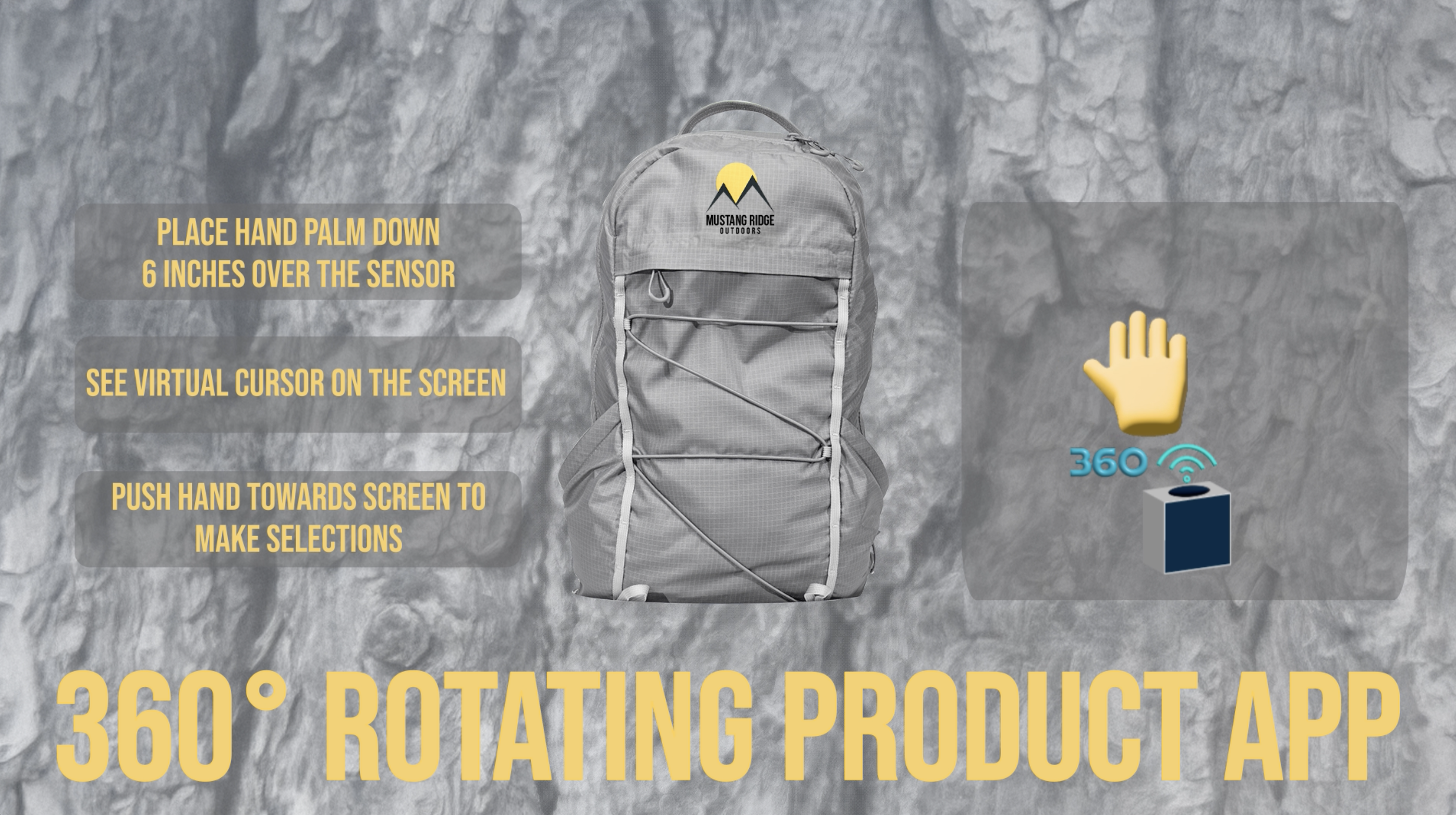
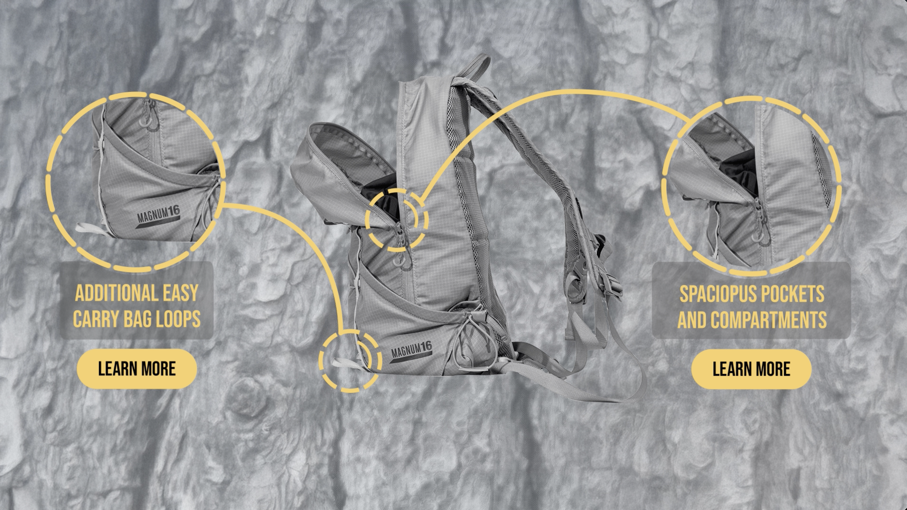
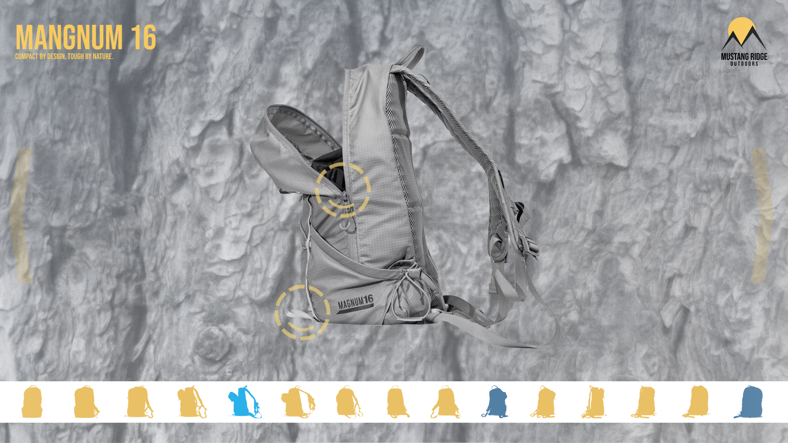
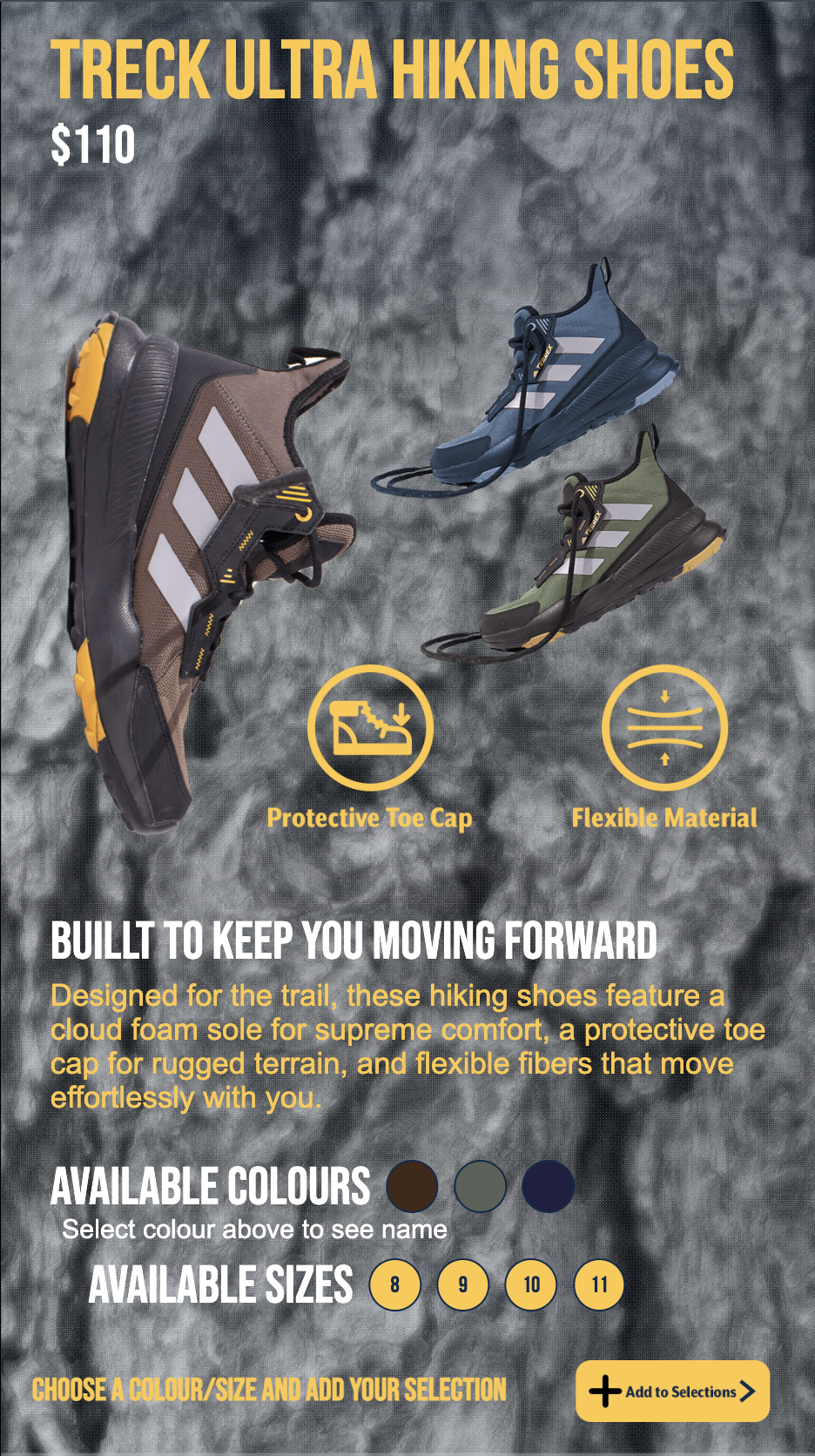
Mustang Ridge — Brand Book & Marketing
Complete brand identity system and marketing materials for an outdoor lifestyle brand
Retail Installation
A three-station interactive retail installation for Mustang Ridge Outdoors


